Casting Call for MERS-CoV in Korea, 2015
Abstract
We perform an adjustment for observed-but-not-yet-reported cases (aka. nowcasting) for the epidemic curve of the Middle East respiratory syndrome coronavirus (MERS-CoV) outbreak in Korea, 2015. The analysis is based on the publically available WHO data and aims at illustrating how one could do real-time public health surveillance during critical outbreaks.
 This work is licensed under a Creative Commons
Attribution-ShareAlike 4.0 International License. The
markdown+Rknitr source code of this blog is available under a GNU General Public
License (GPL v3) license from github.
Introduction
Short-range (0-6h) forecasts in the world of meteorology are also called nowcasts. The term has also found its way into real-time infectious disease monitoring where one of its uses has been to adjust the currently available epidemic curve during an outbreak for structural and reporting delays.
Whereas the original work in Höhle and an der Heiden
(2014) was motivated by the large STEC O104:H4 outbreak in
Germany 2011, one of our secondary motivations was to develop a tool the
quantitative epidemiologist could use during similar high-profiled
outbreaks (instead of having to re-invent the wheel during times of
maximal stress). After my talk at the IBC2016
conference (slides of
the talk - our received the Best Paper in Biometrics by an IBS
Member in 2014 award), one of the questions from the audience was
how much impact the work had in terms of being useful for other
outbreaks. Besides an analysis of an Adenovirus outbreak and a recent
analysis of an O157 outbreak, I was a little short on a convincing
answer. In addition, when trying to make a quick analysis for the O157
outbreak with the currently available code in the
surveillance package it became obvious that the nowcasting
functionality in the package currently is a little rough and certainly
in need of a user-friendliness polishing.
So this little blog-note serves three purposes:
- Illustrate how you can nowcasts with R, if you ever have to.
- Act as literate programming document for facilitating some code
improvements of the
nowcastfunction while providing a vignette supported story. - Perform an analysis of the WHO open-data on the MERS-CoV outbreak in Korea in 2015.
The structure of this blog entry is as follows. We first discuss and visualize the WHO data on the MERS-CoV outbreak. The findings from the descriptive data analysis are then used to set up nowcasts adjusting the observed epidemic curve during the outbreak for reporting delays between onset of symptoms in cases and the date the case report arrived at the WHO. Finally, we illustrate how to visualize a sequence of nowcasts during an outbreak using an animation.
Update 2020-04-21: Regarding the lack of convincing use-case mentioned above. Four years after writing this blog post I can now add: The nowcast functionality of the package is now in use by the public health authorities in several German federal states as part of their Covid-19 outbreak response, see for example Bavaria.
Data
The data basis for our analysis is the WHO data on the MERS-Cov outbreak in Korea, which occured during May-July 2015. Of interest will be the delay (here measured in days) between the time point on which a case has the onset of its MERS symptoms and the day the WHO learns about this case. In other words we put ourself in the role of an epidemiologist working at the WHO and who during the outbreak has to report on how the outbreak is evolving in Korea.
##Load library to read excel files
library("openxlsx")

##Obtain file from link found at (if it doesn't already exist)
##http://www.who.int/csr/don/21-july-2015-mers-korea/en/
if (!file.exists("../downloads/MERS-CoV-cases-rok-21Jul15.xlsx")) {
  download.file(url="http://www.who.int/entity/csr/disease/coronavirus_infections/MERS-CoV-cases-rok-21Jul15.xlsx?ua=1",destfile="../downloads/MERS-CoV-cases-rok-21Jul15.xlsx")
}

##Read data
linelist <- read.xlsx("../downloads/MERS-CoV-cases-rok-21Jul15.xlsx",startRow=4,detectDates=TRUE)

##Base R style - IMHO easier to understand than the dplyr way to do the same
for (dateCol in c("Date.of.notification.to.WHO","Date.of.symptoms.onset","Date.of.first.hospitalization","Date.of.laboratory.confirmation","Date.of.outcome")) {
  linelist[,dateCol] <- as.Date(linelist[,dateCol],format="%d/%m/%Y")
}

##Make a delay column
linelist$delay <- with(linelist,Date.of.notification.to.WHO - Date.of.symptoms.onset)

head(linelist,n=3)
## Case.no. Date.of.notification.to.WHO Age Sex Health.care.worker Comorbidities
## 1 1 2015-05-20 68 M No <NA>
## 2 2 2015-05-22 63 F No <NA>
## 3 3 2015-05-22 76 M No <NA>
## Date.of.symptoms.onset Date.of.first.hospitalization Date.of.laboratory.confirmation
## 1 2015-05-11 2015-05-15 2015-05-20
## 2 2015-05-19 <NA> 2015-05-20
## 3 2015-05-20 <NA> 2015-05-20
## Status Date.of.outcome delay
## 1 Alive <NA> 9 days
## 2 Alive <NA> 3 days
## 3 Deceased 2015-06-04 2 daysAs the outbreak is already over, it is easy to visualize the epidemic curve in retrospect. We do so for the date of symptom onset.
##Show the epidemic curve as it occurs at the end of the outbreak
##using simple call to ggplot
ggplot2::ggplot( linelist, aes(x=Date.of.symptoms.onset)) + geom_histogram() + xlab("Date of onset of symptoms") + ylab("Number of cases")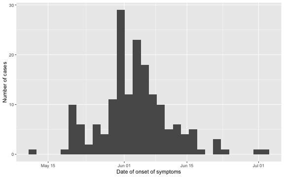
Furthermore, we can look at the delay distribution as it looks at the end of the outbreak. We shall later look in more detail at this distribution, but for now the plot gives an idea about the range of the delay: in most cases the delay is between 1-14 days, actually 97.1% of the observations have a lag smaller or equal to \(D=14\). As a consequence, we shall use \(D=14\) as the maximum relevant lag to adjust for.
ggplot( linelist, aes(x=as.integer(delay),y=..prop..)) +
 stat_count() + scale_y_continuous(labels = scales::percent) + xlab("Delay (days)") + ylab("")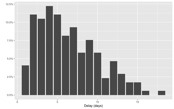
Instead of using ggplot to show the epidemic curve, this
can also be done directly from the surveillance package using the
function linelist2sts. This function takes a
data.frame representing a linelist and converts this into
an object of class sts (surveillance time series) used by
the package. This then allows the use of all the plotting functionality
of such objects as described in Salmon, Schumacher, and Höhle
(2016). Note: For the nowcasting code of this blog entry to work,
the newest development version of the package, i.e. version 1.12.2
available from Rforge using
install.packages("surveillance",repos="http://r-forge.r-project.org")
is needed. The code then looks as follows:
##Load surveillance pkg.
library("surveillance")

##Range of the symptom onset date variable
so_range <- range(linelist$Date.of.symptoms.onset, na.rm=TRUE)

##Create an sts time series from the linelist, which contains daily counts.
sts <- linelist2sts(linelist, dateCol="Date.of.symptoms.onset", aggregate.by="1 day", dRange=so_range)

##Show the resulting time series using the plot functionality for sts objects.
plot(sts,legend.opts=NULL,
     xaxis.tickFreq=list("%d"=atChange,"%m"=atChange),
     xaxis.labelFreq=list("%d"=at2ndChange),xaxis.labelFormat="%d-%b",
     xlab="Time (days)",lty=c(1,1,1,1),lwd=c(1,1,2),
     ylab="No. symptom onsets")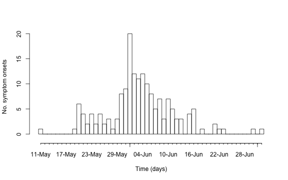
Nowcasting
We now move on to the nowcasts.
##State which date to nowcast
now <- as.Date("2015-06-12")
Say (in a mathematical sense) we move back time to 2015-06-12. In the
notation of Höhle and an der Heiden
(2014) this means \(T=2015-06-12\). We want to illustrate what
the WHO could see at this point and, on the basis on the available
reports at time \(T\), estimate the
delay distribution and adjust the observed cases accordingly. We shall
here only use the right-truncation delay adjusted procedure operating on
the generalized Dirichlet distribution. Since the nowcasts for the time
points very close to now are very volatile (i.e. have very large
credibility regions), it’s opportune to not display these casts as they
can be very hard to communicate. Also note that the selected date for
now is selected such that enough cases are available to
give a sufficiently reliable estimate for the delay distribution.
##Nowcasts are displayed up to time (now - safePredictLag)
safePredictLag <- 3
nowcastDates <- seq(from = so_range[1], to = now - safePredictLag, by = 1)
We now perform right-truncation adjusted Bayesian nowcasting using the generalized Dirichlet distribution. An important choice is here the prior for the expected number of cases per day, i.e. \(\lambda_t\) in the notation of Höhle and an der Heiden (2014). In the conjugate case this is specified by assuming an iid. Gamma-distribution for \(\lambda_t\), which is specified through prior mean and prior variance of the Gamma distribution. We here select here an empirical Bayes inspired approach and estimate these parameters from the currently available data. However, note: These data are by definition of the problem incomplete. As a dirty fix we therefore just inflate the prior variance by a factor - as future work this needs to be improved upon by following a proper marginal likelihood approach.
nc.control <- list(
  N.tInf.prior = structure("poisgamma",
                           mean.lambda = mean(observed(sts)),
                           var.lambda = 5*var(observed(sts))
                           ),
  ##compute predictive distribution as wel, which is needed for some of the
  ##animations.
  predPMF = TRUE,
  dRange = so_range)

## Now run the nowcast (NA dates are removed from the dataset).
nc <- nowcast(now = now, when = nowcastDates, data = linelist,
              dEventCol = "Date.of.symptoms.onset",
              dReportCol = "Date.of.notification.to.WHO",
              method = "bayes.trunc", #use the conjugate generalized dirichlet
              aggregate.by = "1 day",
              D = 14, #adjust cases up to 2 weeks back.
              control = nc.control)
## Removed 13 records due to NA dates.The resulting object is of class stsNC, which is just a
class inheriting from the sts class. Hence, all the usual
plotting functions apply to it. In addition, a plot of an
stsNC object as shown below, contains the median of the
pointwise predictive distribution (thick blue line) as well as
equi-tailed 95% credibility regions (dashed orange lines).
plot(nc, legend.opts=NULL,
     xaxis.tickFreq=list("%d"=atChange,"%m"=atChange),
     xaxis.labelFreq=list("%d"=at2ndChange),xaxis.labelFormat="%d-%b",
     xlab="Time (days)",lty=c(1,1,1,1),lwd=c(1,1,2),
     ylab="No. symptom onsets",ylim=c(0,max(observed(nc),upperbound(nc),predint(nc),na.rm=TRUE)))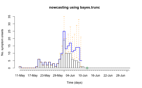
Finally, we can for stsNC objects show a simple
non-parametric estimate of the delay distribution as a function of time
using a window-smoothed approach with window width \(2w+1\), see Höhle and an der Heiden
(2014) for details.
plot(nc, type="delay", dates=seq(so_range[1],now,by="1 day"),w=1)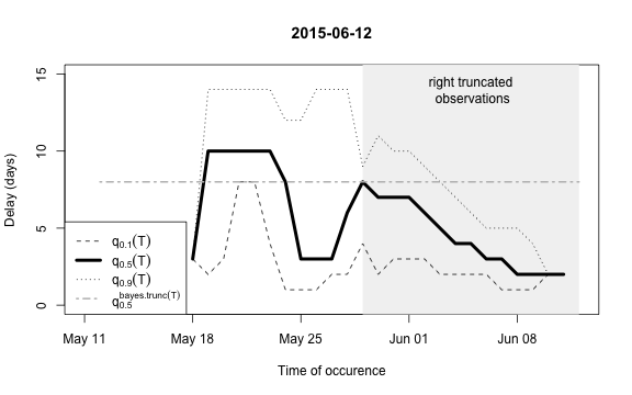
The figure shows for each time point \(t\) the median as well as the 10% and 90%
quantile of the empirical distribution of delays within the window of
\(t-w,\ldots,t+w\). Note: This simple
estimate ignores the right- truncation, hence, within the period of
(now-D):now there will be a bias of these estimates towards
shorter delays. This biased period is illustrated in the figure by the
light-gray shaded area. Furthermore, the median of the model based
estimate for the delay distribution is shown for the period of
(now-m:now). From the figure one has the suspicion that the
delay decreased a bit over time, but the decrease totally at the end
could also be due to right-truncation. However, assuming a
time-invariant delay distribution for the entire
outbreak would probably give unsatisfactory results. Hence, we shall for
each time point use only a moving window consisting of all observations
occuring within the period (now-m):now. We select \(m=14\) for estimating the delay
distribution.
This means that only the \(m+1\)=15 most recent days of the reporting triangle are considered at each instance of “now” when estimating the delay distribution, i.e. there will be 15 observations on number of reports with a delay of 0 days, there will be 14 observationson on number of reports with a delay of 1 day, …, there will be 1 observation on number of reports with a delay 14 days. Based on the right-truncation adjusted estimation procedure these observations then lead to an estimate of the PMF of the delay. Due to the sliding window this estimate will be more uncertain (especially for the long delays), but if the delay reduces over time, this is more appropriately reflected, because old cases do not contribute to the delay estimation anymore.
Showing a sequence of nowcasts
Once a couple of nowcasts have been performed it can also be helpful
to visualize the sequence of nowcasts using an animation. This is easily
done by first generating a list of nowcast results followed by a call to
surveillance::animate_nowcasts.
##Nowcast all time points (except for the first three weeks). This might take a while.
nowcasts <- list()
animRange <- seq(so_range[1]+21,so_range[2],by="1 day")

##Do nowcasts for the rage of dates
for (i in seq_len(length(animRange))) {
  today <- animRange[i]
  print(as.character(today))

  new_nowcastDates <- seq(from = so_range[1], to = today - safePredictLag, by = 1)

  nowcasts[[as.character(today)]] <- nowcast(
    now = today, when = new_nowcastDates, data = linelist,
    dEventCol = "Date.of.symptoms.onset",
    dReportCol = "Date.of.notification.to.WHO",
    method = "bayes.trunc",
    aggregate.by = "1 day",
    D = 14,
    m = 14, ##moving window of 14+1 days for estimation
    control = nc.control)
}
We will use the animation package to wrap the call to
animate_nowcasts in order to generate an animated GIF.
Better control over the obtained animation can be obtained using the
animation::saveHTML function. If one wants to include the
animation into a Power-Point presentation, I recommend the use of Flash
animations (animation::saveSWF). Note that the animation
package requires ImageMagick to be
installed on your system.
animation::saveGIF( {
  par(mar=c(5.5, 4, 2, 2) + 0.1) ; ##add extra space at the bottom and remove at top
  animate_nowcasts(nowcasts = nowcasts,
                   linelist_truth = linelist,
                   method = "bayes.trunc", #nowcast method to use (has to be in the casts)
                   control = list(sys.sleep=0,dRange=nc.control$dRange,anim.dRange=range(animRange),ylim=c(0,40))) },
  movie.name="animate-nowcasts.gif", ani.width=800, ani.height=500)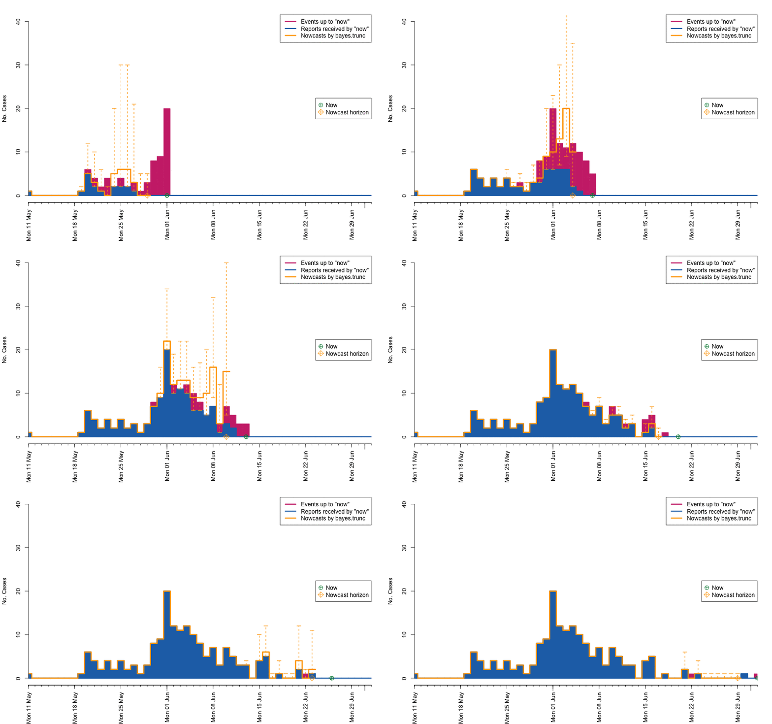
As a final comparison we can also obtain an animation of how the delay distribution changes with time. From the animation we notice that the delay appears to steadily decrease, which is a typical behavior for high-profiled outbreaks. However, this also questions the assumption of a time-invariant delay distribution. Instead, one could use a window-limited estimation approach or one could try to model the delay distribution using a discrete time survival model as done in Höhle and an der Heiden (2014). The animation below uses the above mentioned sliding-window approach, which is noticed by the estimate of \(q_{0.5}^{\text{bayes.trunc(T)}}\) changing for each \(T\).
animation::saveGIF(
  for (i in seq_len(length(nowcasts))) {
    plot(nowcasts[[i]], w=3, type="delay")
  },
  movie.name="animate-delays.gif", ani.width=800, ani.height=500)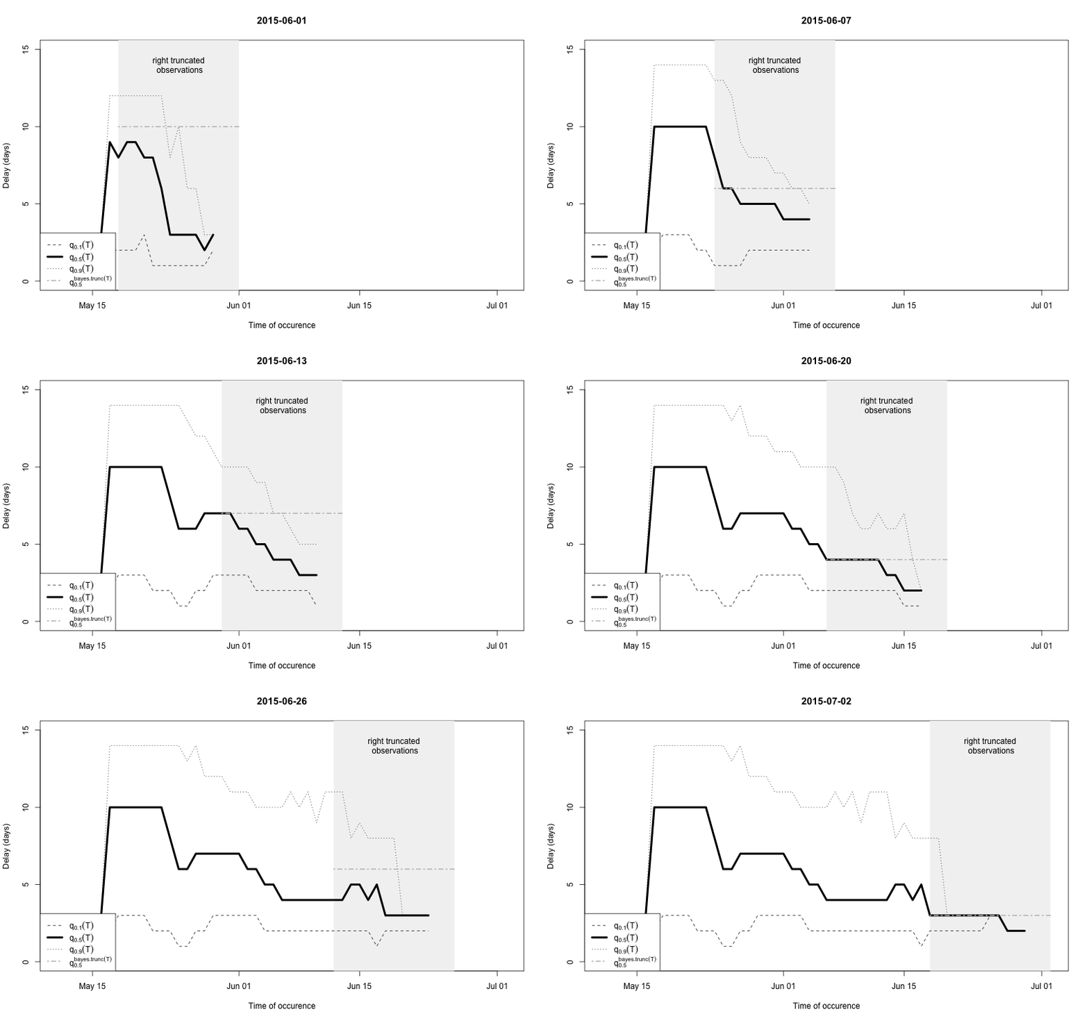
Discussion
The adjustment of occurred-but-not-yet-reported-events applies to many other application areas besides real-time public health monitoring. For example, direct links to claims reserve modelling in actuarial sciences exist, but many other areas of application, where delays play a role, appear of interest. For the methodological details of the nowcasting procedures see Höhle and an der Heiden (2014), which is available as open access document. The present blog entry focused on getting methods operational using R - the R code of this blog post is available from github.
Acknowledgements
Work on the surveillance package was supported by the Swedish Research Council (2015_05182_VR).