Superspreading and the Gini Coefficient
Abstract:
We look at superspreading in infectious disease transmission from a statistical point of view. We characterise heterogeneity in the offspring distribution by the Gini coefficient instead of the usual dispersion parameter of the negative binomial distribution. This allows us to consider more flexible offspring distributions.

 This work is licensed under a Creative Commons
Attribution-ShareAlike 4.0 International License. The
markdown+Rknitr source code of this blog is available under a GNU General Public
License (GPL v3) license from github.
Motivation
The recent Science report on Superspreading during the COVID-19 pandemic by Kai Kupferschmidt has made the dispersion parameter \(k\) of the negative binomial distribution a hot quantity1 in the discussions of how to determine effective interventions. This short blog post aims at understanding the math behind statements such as “Probably about 10% of cases lead to 80% of the spread” and replicate them with computations in R.
Warning: This post reflects more my own learning process of what is superspreading than trying to make any statements of importance.
Superspreading
Lloyd-Smith et al. (2005) show that the 2002-2004 SARS-CoV-1 epidemic was driven by a small number of events where one case directly infected a large number of secondary cases - a so called superspreading event. This means that for SARS-CoV-1 the distribution of how many secondary cases each primary case generates is heavy tailed. More specifically, the effective reproduction number describes the mean number of secondary cases a primary case generates during the outbreak, i.e. it is the mean of the offspring distribution. In order to address dispersion around this mean, Lloyd-Smith et al. (2005) use the negative binomial distribution with mean \(R(t)\) and over-dispersion parameter \(k\) as a probability model for the offspring distribution. The number of offspring that case \(i\), which got infected at time \(t_i\), causes is given by \[ Y_{i} \sim \operatorname{NegBin}(R(t_i), k), \] s.t. \(\operatorname{E}(Y_{i}) = R(t_i)\) and \(\operatorname{Var}(Y_{i}) = R(t_i) (1 + \frac{1}{k} R(t_i))\). This parametrisation makes it easy to see that the negative binomial model has an additional factor \(1 + \frac{1}{k} R(t_i)\) for the variance, which allows it to have excess variance (aka. over-dispersion) compared to the Poisson distribution, which has \(\operatorname{Var}(Y_{i}) = R(t_i)\). If \(k\rightarrow \infty\) we get the Poisson distribution and the closer \(k\) is to zero the larger the variance, i.e. the heterogeneity, in the distribution is. Note the deliberate use of the effective reproduction number \(R(t_i)\) instead of the basic reproduction number \(R_0\) (as done in Lloyd-Smith et al. (2005)) in the model. This is to highlight, that one is likely to observe clusters in the context of interventions and depletion of susceptibles.
That the dispersion parameter \(k\) is making epidemiological fame is a little surprising, because it is a parameter in a specific parametric model. A parametric model, which might be inadequate for the observed data. A secondary objective of this post is thus to focus more on describing the heterogeneity of the offspring distribution using classical statistical concepts such as the Gini coefficient.
Negative binomial distributed number of secondary cases
Let’s assume \(k=0.45\) as done in Adam et al. (2020). This is a slightly higher estimate than the \(k=0.1\) estimate by Endo et al. (2020)2 quoted in the Science article. We want to derive statements like “the x% most active spreaders infected y% of all cases” as a function of \(k\). The PMF of the offspring distribution with mean 2.5 and dispersion 0.45 looks as follows:
Rt <- 2.5
k  <- 0.45

# Evaluate on a larger enough grid, so E(Y_t) is determined accurate enough
# We also include -1 in the grid to get a point (0,0) needed for the Lorenz curve
df <- data.frame(x=-1:250) %>% mutate(pmf= dnbinom(x, mu=Rt, size=k))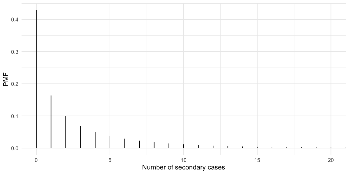
So we observe that 43% of the cases never manage to infect a secondary case, whereas some cases manage to generate more than 10 new cases. The mean of the distribution is checked empirically to equal the specified \(R(t)\) of 2.5:
sum(df$x * df$pmf)## [1] 2.5Lloyd-Smith et al. (2005) define a superspreader to be a primary case, which generates more secondary cases than the 99th quantile of the Poisson distribution with mean \(R(t)\). We use this to compute the proportion of superspreaders in our distribution:
(superspreader_threshold <- qpois(0.99, lambda=Rt))## [1] 7(p_superspreader <- pnbinom(superspreader_threshold, mu=Rt, size=k, lower.tail=FALSE))## [1] 0.09539277So 10% of the cases will generate more than 7 new cases. To get to statements such as “10% generate 80% of the cases” we also need to know how many cases those 10% generate out of the 2.5 average.
# Compute proportion of the overall expected number of new cases
df <- df %>% mutate(cdf = pnbinom(x, mu=Rt, size=k),
                    expected_cases=x*pmf,
                    prop_of_Rt=expected_cases/Rt,
                    cum_prop_of_Rt = cumsum(prop_of_Rt))

# Summarise
info <- df %>% filter(x > superspreader_threshold) %>%
  summarise(expected_cases = sum(expected_cases), prop_of_Rt = sum(prop_of_Rt))
info
## expected_cases prop_of_Rt
## 1 1.192786 0.4771144In other words, the superspreaders generate (on average) 1.19 of the 2.5 new cases of a generation, i.e. 48%.
These statements can also be made without formulating a superspreader threshold by graphing the cumulative share of primary cases against the cumulative share of secondary cases these primary cases generate. This is exactly what the Lorenz curve is doing. However, for outbreak analysis it appears clearer to graph the cumulative distribution in decreasing order of the number of offspring generated, i.e. following Lloyd-Smith et al. (2005) we plot the cumulative share as \(P(Y\geq y)\) instead of \(P(Y \leq y)\). This is a variation of the Lorenz curve, but allows statements such as “the %x cases with highest number of offspring generate %y of the secondary cases”.
# Add information for plotting the modified Lorenz curve
df <- df %>%
  mutate(cdf_decreasing = pnbinom(x-1, mu=Rt, size=k, lower.tail=FALSE)) %>%
  arrange(desc(x)) %>%
  mutate(cum_prop_of_Rt_decreasing = cumsum(prop_of_Rt))
# Plot the modified Lorenz curve as in Fig 1b of Lloyd-Smith et al. (2005)
ggplot(df, aes(x=cdf_decreasing, y=cum_prop_of_Rt_decreasing)) + geom_line() +
coord_cartesian(xlim=c(0,1)) +
xlab("Proportion of the infectious cases (cases with most secondary cases first)") +
ylab("Proportion of the secondary cases") +
scale_x_continuous(labels=scales::percent, breaks=seq(0,1,length=6)) +
scale_y_continuous(labels=scales::percent, breaks=seq(0,1,length=6)) +
geom_line(data=data.frame(x=seq(0,1,length=100)) %>% mutate(y=x), aes(x=x, y=y), lty=2, col="gray") + ggtitle(str_c("Scenario: R(t) = ", Rt, ", k = ", k))
Update 2020-06-01: Hernando Cortina made me aware
that plotting the Lorenz curve for decreasing values is easily done
using the gglorenz
package. However, it requires a sample. So a quick way to do all the
above for the negative binomial without thinking about CDFs, proportions
of \(R(t)\) etc. is to just generate a
sample of arbitrary size from the PMF and then plot the decreasing
Lorenz curve.
# Sample an articial population so we can use the empirical lorenz curve
outbreak <- data.frame(secondary_cases=rnbinom(10000, mu=Rt, size=k))

ggplot(outbreak, aes(secondary_cases)) + gglorenz::stat_lorenz(desc=TRUE) +
  xlab("Proportion of the infectious cases (cases with most secondary cases first)") +
  ylab("Proportion of the secondary cases") +
  scale_x_continuous(labels=scales::percent, breaks=seq(0,1,length=6)) +
  scale_y_continuous(labels=scales::percent, breaks=seq(0,1,length=6)) +
  geom_line(data=data.frame(x=seq(0,1,length=100)) %>% mutate(y=x), aes(x=x, y=y), lty=2, col="gray") + ggtitle(str_c("Scenario: R(t) = ", Rt, ", k = ", k))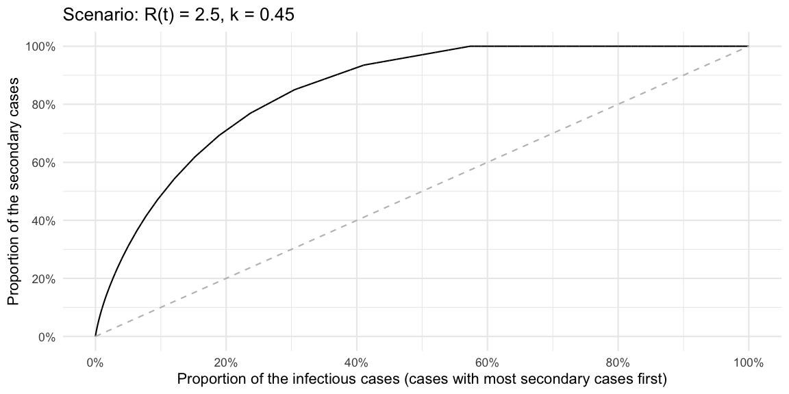
Gini Coefficient
Using the standard formulas to compute the Gini coefficient for a discrete distribution with support on the non-negative integers, i.e. \[ G = \frac{1}{2\mu} \sum_{y=0}^\infty \sum_{z=0}^\infty f(y) f(z) |y-z|, \] where \(f(y)\), \(y=0,1,\ldots\) denotes the PMF of the distribution and \(\mu=\sum_{y=0}^\infty y f(y)\) is the mean of the distribution. In our case \(\mu=R(t)\). From this we get
# Gini index for a discrete probability distribution
gini_coeff <- function(df) {
  mu <- sum(df$x * df$pmf)
  sum <- 0
  for (i in 1:nrow(df)) {
    for (j in 1:nrow(df)) {
      sum <- sum + df$pmf[i] * df$pmf[j] * abs(df$x[i] - df$x[j])
    }
  }
  return(sum/(2*mu))
}

gini_coeff(df)
## [1] 0.704049A plot of the relationship between the dispersion parameter and the
Gini index, given a fixed value of \(R(t)=2.5\), looks as follows
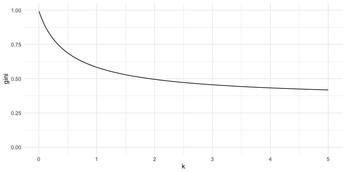
We see that the Gini index converges from above to the Gini index of the Poisson distribution with mean \(R(t)\). In our case this limit is
gini_coeff( data.frame(x=0:250) %>% mutate(pmf = dpois(x, lambda=Rt)))## [1] 0.3475131Red Marble Toy Example
For the toy example offspring distribution used by Christian Drosten in his Coronavirus Update podcast on COVID-19 superspreading (episode 44, in German). The described hypothetical scenario is translated to an offspring distribution, where a primary case either generates 1 (with probability 9/10) or 10 (with probability 1/10) secondary cases:
# Offspring distribution
df_toyoffspring <- data.frame( x=c(1,10), pmf=c(9/10, 1/10))

# Hypothetical outbreak with 10000 cases from this offspring distribution
y_obs <- sample(df_toyoffspring$x, size=10000, replace=TRUE, prob=df_toyoffspring$pmf)

# Fit the negative binomial distribution to the observed offspring distribution
# Note It would be better to fit the PMF directly instead of to the hypothetical
# outbreak data
(fit <- MASS::fitdistr(y_obs, "negative binomial"))
## size mu
## 1.73380924 1.87481616
## (0.03857807) (0.01975387)# Note: different parametrisation of the k parameter
(k.hat <- 1/fit$estimate["size"])## size
## 0.5767647In other words, when fitting a negative binomial distribution to
these data (probably not a good idea) we get a dispersion parameter of
0.58.
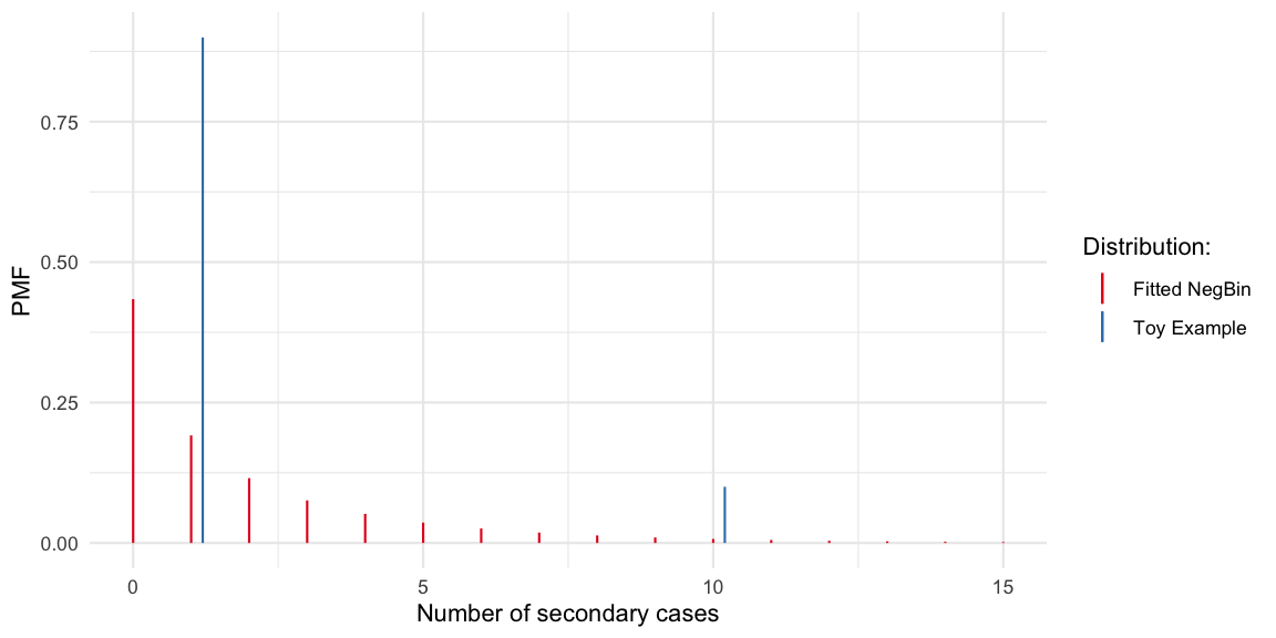 The Gini coefficient of this fitted negative distribution is 0.68. If we
instead compute the Gini coefficient for the distribution directly we
get
gini_coeff(df_toyoffspring) ## [1] 0.4263158Altogether, it can be discussed how much gain there is in using more flexible distributions to model the COVID-19 offspring distribution. The distribution is likely to center around 0-5, but with some mass above 10+. Too many additional parameters probably do not make sense. However, one consequnce of assuming negative binomial distributed offspring distribution is that we accept Poisson-offspring as the minimum lvl of heterogeneity. This might be theoretically justified, but the Gini index would allow for a unified reporting of heterogeneity independent of assumptions about the parametric shape of the offspring distribution. In the toy example case, a negative binomial distribution was certainly not an adequate distribution, but of course this is just a toy example.
Simulation
We can use the R0::sim.epid function to simulate 1000
trajectories of an outbreak with negative binomial offspring
distribution (c.f. effective
reproduction number post) having mean 2.5 and dispersion parameter
0.45. For ease of exposition we use a constant generation time of 1 day,
start with 1 infectious case at generation time 0, and then simulate the
epidemic for 10 additional generations.
# Fixed generation time GT, for simplicity time scale is equal to GT, i.e. GT=1
gt <- R0::generation.time(type="empirical", val=c(0,1))
# Simulate 10 epidemics,
raw_sims <- R0::sim.epid(epid.nb=1000, GT=gt, R0=Rt, epid.length=10, peak.value=1e5, family="negbin", negbin.size=k)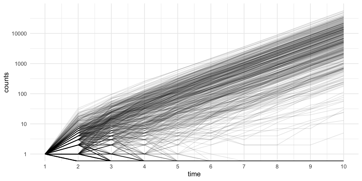 Note that the plot uses a log-10 logarithmic y-axis. Furthermore, we see
that 44% of the simulations become extinct in generation 1, because the
initial case does not manage to generate any new cases. This matches the
\(P(Y_i=0)\) probability under the
corresponding negative binomial distribution. Furthermore, 59% of the
simulations have a final size of 10 or less cases.
Discussion
The effect of superspreaders underlines the stochastic nature of the dynamics of an person-to-person transmitted disease in a population. The dispersion parameter \(k\) is conditional on the assumption of a given parametric model for the offspring distribution (negative binomial). The Gini index is an alternative characterisation to measure heterogeneity. However, in both cases the parameters are to be interpreted together with the expectation of the distribution. Estimation of the dispersion parameter is orthogonal to the mean in the negative binomial and its straightforward to also get confidence intervals for it. This is less straightforward for the Gini index.
A heavy tailed offspring distribution can make the disease easier to control by targeting intervention measures to restrict superspreading (Lloyd-Smith et al. 2005). The hope is that such interventions are “cheaper” than interventions which target the entire population of infectious contacts. However, the success of such a targeted strategy also depends on how large the contribution of superspreaders really is. Hence, some effort is needed to quantify the effect of superspreaders. Furthermore, the above treatment also underlines that heterogeneity can be a helpful feature to exploit when trying to control a disease. Another aspect of such heterogeneity, namely its influence on the threshold of herd immunity, has recently been invested by my colleagues at Stockholm University (Britton, Ball, and Trapman 2020).